The tools analysts use today were all built for a particular purpose at a particular time. But these same tools are holding us back. Now is the ideal time to step back and see what of these legacy tools we carry with us, and what we leave behind.
Given the demand for analytical insights is at an all-time high, it’s amazing to think the analyst’s workflow has been virtually unchanged for over a decade.
And while there’s certainly been progress to make individual tasks easier, the workflow often remains a patchwork of hackneyed software held together with CSV files and emails.
To illustrate just how painful the analyst workflow can be, we’ve assembled a few of our favorite examples…
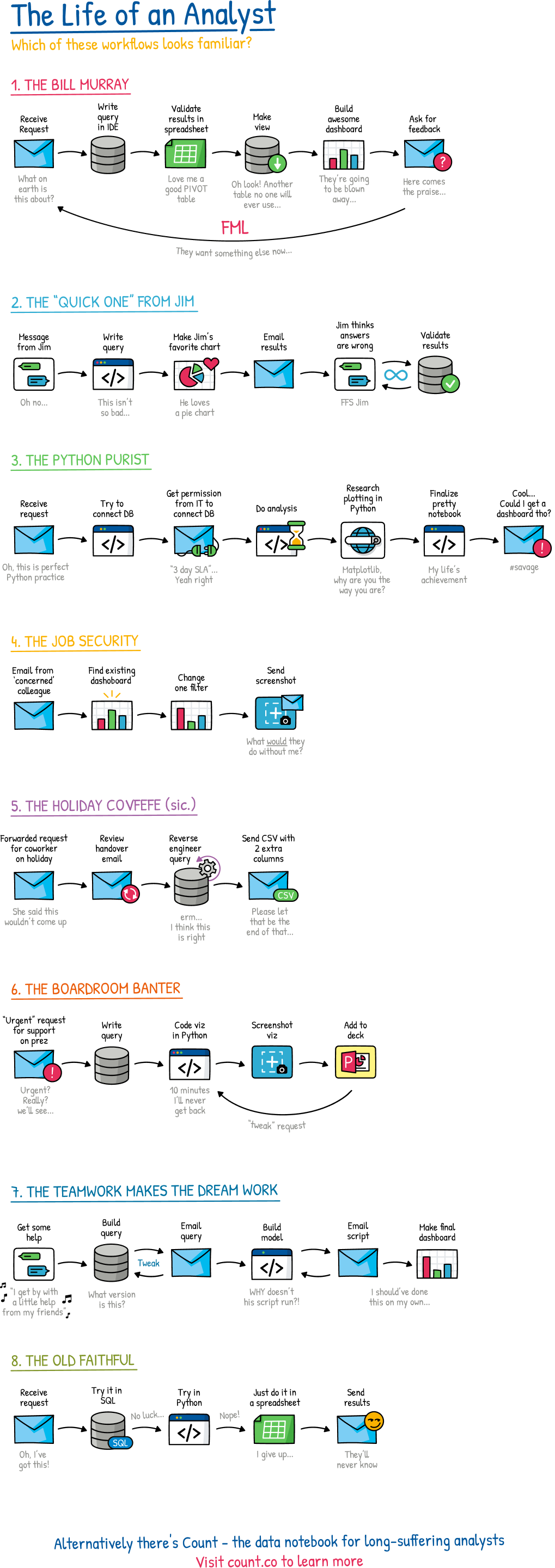
Though designed to be at least a little humorous, the diagram underscores a serious point: None of our current data tools provide everything we need to meet today’s analytical demands.
But to be fair, they were never designed to…
So how did we get here? We’ll take a quick historical detour to find out…While BI (Business Intelligence) was first mentioned in the late 19th century, and I encourage you to read more about it, we’re going to fast forward and focus on the history of the BI tools we still use today.
SQL IDEs (Integrated Development Environments) were designed for database administrators to query and manage data in their new relational databases. These no-frills interfaces gave a handful of highly-trained technical users the ability to do everything from creating a table to, erm, running a query.
Our beloved spreadsheet was designed to enable accountants to digitize paper accounting worksheets. Their cell-based interface provided flexibility in both formatting and computation. Users can build highly proficient financial models, but any actual analytics were limited to only small datasets.
Data Visualisation tools finally brought data to the boardroom. With a friendly interface, and high-quality data visualization capabilities, business users could start using data in decision making, but only for simple queries.
Although computational notebooks, like Mathematica, were first seen in the 80s, they didn’t arrive on the data scene until the data science era of the 2010s. These notebooks help data scientists build and deploy complex models and analyses using programming languages like R and Python. While very powerful, and flexible, they come with a steep learning curve.
The analyst’s landscape has undoubtedly changed since each of these tools first appeared.
The role of analysts has continued to grow. Analysts are now asked to manage an entire data journey from database to boardroom presentation — a process that used to be shared across many roles and departments.
Data is bigger and faster. We’ve gone from a few relational tables to today’s era of Big Data, where we commonly measure data in terabytes, not megabytes. Databases, too, have gotten faster, and more efficient. It’s been a welcome change for those of us who’ve spent far too long optimizing our queries and allows us to analyze data directly from our databases for the very first time.
Our data appetite is voracious. We’re no longer satisfied with one or two dashboards on our production database. To stay ahead of the competition, our questions are getting more frequent and more nuanced. We don’t live in a world of a few large queries anymore; we’re living in a world that’s constantly asking questions to stay ahead.
With this new context, there’s a big opportunity to design tools that are built for modern analytical challenges.
Though there are many potential candidates, most are extensions of the tool types mentioned above. But as the workflows show we don’t need new versions of the old tools. We need a hybrid approach: a BI notebook.

A BI notebook borrows our favorite features of our current toolbox to create something new, albeit familiar.
This is not one size fits all. For particular use cases (i.e., a data science model), a more specialist tool will always be preferred. But for the vast majority of an analyst’s work the BI notebook can dramatically improve productivity and the impact their work has on the rest of the organization.
For the last few years, we’ve been crafting our own BI notebook at Count. If you’d like to check it out for yourself, you can get a free account here.
This is article two of our “a call for better analyst’s tooling” series. Other articles in the series include:


